Hi, I'm Cinthya.

I help teams figure out what's worth building, then get it shipped from idea to launch.

Product Manager. I spent 4.5 years as the sole PM at LOGO.com, a branding platform with 1M+ monthly visitors. I built the roadmap, processes and analytics from the ground up, took our link in bio tool to a full AI website builder, and rebuilt the logo editor. For me, launch is the midpoint: I tracked the metrics, learned from users and iterated until reaching our KPI goals.

Project Manager. Working in startups has meant wearing many hats, and one I've always worn is Project Manager. Across different industries, I've owned execution from start to finish: organizing teams, keeping everyone aligned, and making sure what we planned actually shipped.

Designer at heart. I started as a Product Designer and spent 6 years in the craft. That's why I hold a high quality bar. I know what good design and a good user experience look like because I've built them myself.

Cinthya Flores smiling

About me

Recent experience

Product Manager / Project Manager · LOGO.com

Apr 2022 — Sep 2026

LOGO.com gives entrepreneurs the tools to start a business, with 1M+ monthly visitors. I owned the vision, goals and roadmap for every product, from the logo editor and website builder to domains and AI tools. I built the processes and analytics from the ground up, took the website builder from Link in Bio to a multi-agent AI builder, grew monetization through upsell and bundling experiments and managed partnerships like Wix and Printful.
Product Designer / Product Manager · Chorefree Living

Sep 2019 — Oct 2021

A home-services booking platform connecting realtors and property managers with cleaning and maintenance providers. I redesigned the website into a seamless booking experience that cut ordering time to 90 seconds and grew monthly recurring customers, and led product iteration with finance, sales and operations.

UX/UI & Product Designer · Sugar Design Group

May 2019 — Sep 2019

A design agency serving clients across the US and Canada. I created user flows, UI prototypes and design systems for 10+ clients.

Main skills

Product

Vision & roadmapPRDsRICE prioritizationSprintsKPIs & funnelsA/B testingPricing & monetizationPartnerships

AI

Multi-agent pipelinesAI evalsPrototyping with ClaudeAutomations

Design

UX & UIUser testingPrototypingDesign systems

Tools

Claude Code & DesignMixpanelGrowthBookClarityUserbrainChartMogulLinearJiraNotionFigmaSanityHelpScoutExcel

Outside work

🇲🇽

I'm Mexican

I grew up in Mexico City and have called Vancouver home for 7+ years. I'm always missing the tacos, though.

🚀

I'm an entrepreneur

Building my own projects taught me to think like an owner, not just an employee.

💃

I love to dance

I've been part of Mexican folk and Irish dance companies. I've danced everything! (Latin, jazz, tap, samba, you name it!)

🎮

I love board and video games

Horror video games are my favorite, and I love board game nights with friends. Current obsession: Root.

Education

  • Bachelor of Product DesignTecnológico de Monterrey
  • Diploma, Innovation & EntrepreneurshipTamwood Careers
  • Digital Marketing BootcampAlacrity Canada
  • CAPM and PMPIn progress

Transforming our link in bio to a powerful AI website builder.

We transformed our simple link in bio tool into a builder that creates a complete, on-brand website powered by AI.

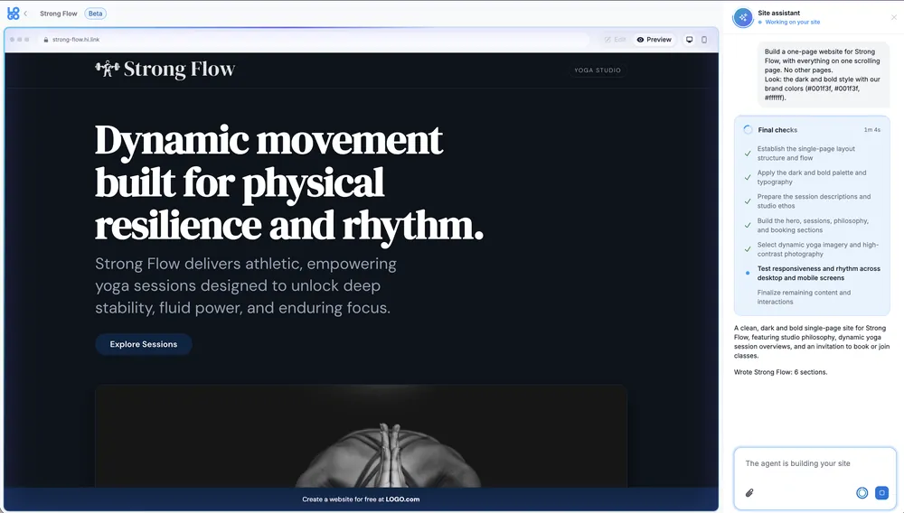
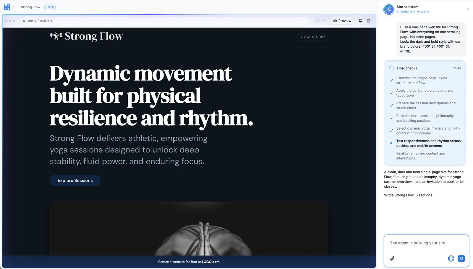
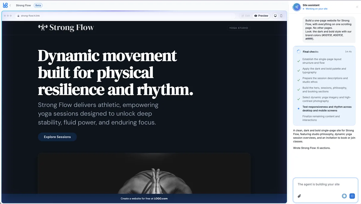
LOGO.com AI website builder: the site assistant building a one-page site for a yoga studio

Context

LOGO.com helps entrepreneurs start a business: logo, website, domain and email. Websites were what people wanted most, driving 48% of all upgrade clicks. Yet our website product was a simple Link in Bio page that could not cover the needs of our users.

Problem

Only 6.3% of people who started a website published it.

  • Users needed more than a link in bio. People came to promote their business, and a single page of links couldn't hold what a real website needs.
  • The blank page killed momentum. Users who started from scratch were 50% less likely to publish.
  • Editing was hard. Like every website builder, a template looks great until you start editing it. Keeping a pre-made page looking good takes design skills most of our users don't have, and the users who engaged with our editor told us it felt complicated.
  • The results didn't match expectations. What people ended up with didn't look like the site they had in mind, so many never published it.

Solution

I ran an extensive review of the market and of competitors, both AI and traditional builders, and talked with power users who were already using LOGO.com websites to promote their products. With the product team, I combined that with quantitative and qualitative data: event tracking and funnels, the pages users actually generated and the features they reached for, to see where the experience was failing and what users were really looking for.

The answer was a balance. Builders like Wix and WordPress are powerful, but that power makes them complex. Our users aren't tech-savvy: they want a site that looks good and covers the basics, without endless customization. And we already had everything we needed from their brand, so we could show them a site instead of asking them to build one. We split the work into three stages:

  1. From link in bio to a real website builder. We added the features a website needs, like sections, background images, text colors, sticky navigation, and revamped the UI, keeping it simple on purpose.
  2. An editor that works with AI first. We trained the model on the editor itself, so AI could control the website builder and make the changes users asked for from a single sentence, with live preview, while also allowing users to have a drag-and-drop and free editing experience.
  3. Templates curated for each user. Today's AI models repeat the same patterns and lack design taste. So the product team designed templates on solid design principles and trained the model on them through a multi-agent pipeline:
    • Specialist agents write the copy, plan the layout and choose the imagery in parallel.
    • Every palette comes from the user's brand and always passes WCAG AA contrast.
    • We judged and evaluated generated sites, refined the templates and iterated with the dev team over many rounds. Fixing a template fixes every site built from it.
    • We ran many rounds of model selection and evaluation, comparing models and prompts for each agent to balance quality, speed and cost.

Now every user starts with a site already built for them, with their colors, fonts, copy and brand, so they need far fewer edits. They can still start from scratch or from a template, but we show people what they need instead of making them find it on their own.

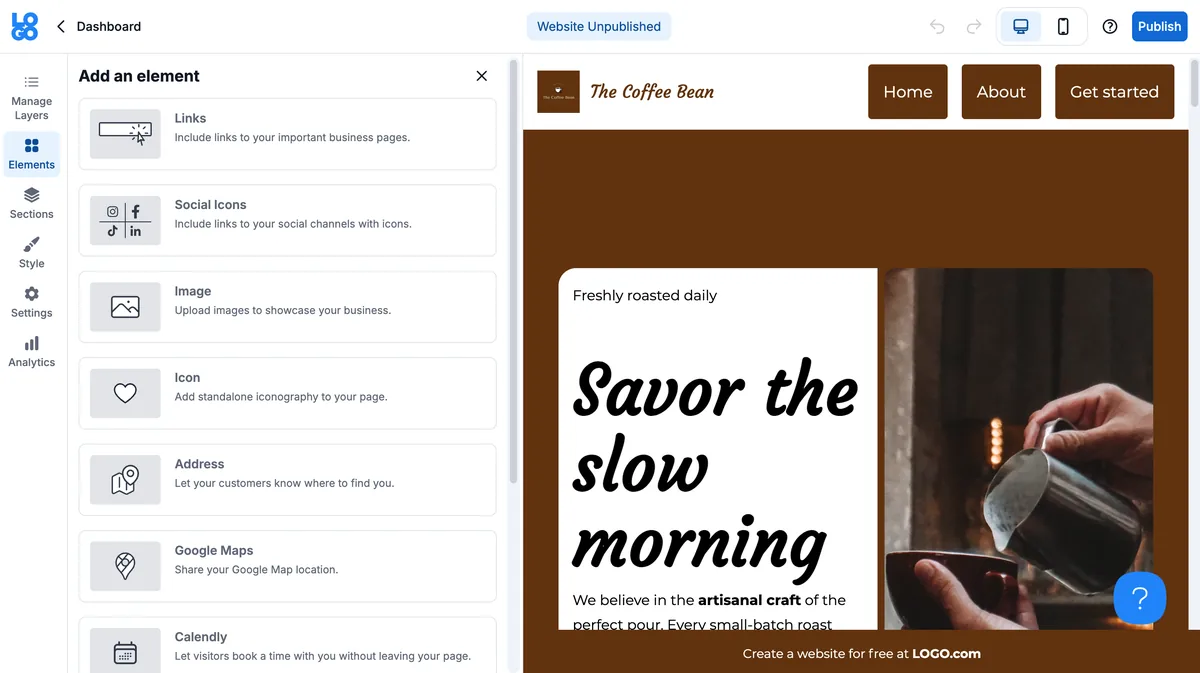
BeforeBefore: the old website editor with element menus and a manually built coffee shop page
AfterAfter: the AI site assistant building a complete one-page site for a yoga studio
From building every section by hand to describing the business and getting a complete site.

How the agent system evolved

We didn't start multi-agent. We learned our way there, through several rounds of iteration.

V1: Broad agents

Our first pipeline had only a few agents: one extracted the brand (colors, fonts, and what the business actually does), one matched a template, and one handled content. A single assembler pulled blocks from different templates and did everything at once: layout, copy, images, and applying the brand. A Design Judge and a final judge checked the result at the end.

What broke: Some agents were doing too much. The assembler was making too many different kinds of decisions in one pass, and it made poor ones. A final, generalist judge could tell us a site wasn't good enough, but it couldn't reliably tell us why, or fix the specific domain that failed. We had no expert judges for each domain, so we were evaluating everything, and therefore nothing well.

V2: Specialize the makers

We split the overloaded work into single-job agents:

  • Brand agent: didn't just extract colors and fonts. It ran them through contrast checks to build a complementary palette that would actually work. Every palette passes WCAG AA contrast.
  • Copywriter agent: wrote the text, and nothing else.
  • Image agent: handled imagery only.
  • Block-selection agent: its only job was choosing the right blocks from our designer-built templates.

That made the pipeline both a bit faster and much more specific: work could run in parallel instead of waiting on one agent to do everything in sequence, and each output could be evaluated, fixed or replaced on its own criteria. A bad palette became a brand-agent problem. Weak copy became a copywriter problem. We stopped regenerating whole sites to fix one thing.

The editor, then the final judge

Specialized parts still need someone to make them a page. So before the final judge, we added an editor agent, playing the role a magazine editor plays. It puts everything together and evaluates the site as a whole: coherence across sections, spacing, and basic website design principles. Only after that editorial pass did the final judge make the last check.

That order matters: specialist agents, specialist checks, an editor for the whole, and only then a final verdict. Fixing a problem stopped being "regenerate and hope" and became "fix this agent, this template, this rule," which then fixed every site built after it. That split, not just adding more agents, is what let quality rise while cost per generated site fell 80%.

Three decisions that defined the product

  1. Show, don't ask. Instead of improving the blank editor, we generated a complete site from the brand the user had already given us. Users who started from scratch were 50% less likely to publish.
  2. Templates over free generation. Pure model output repeated the same patterns and lacked design taste. We invested in designer-built templates and built the pipeline on them. Fixing a template fixes every site built from it.
  3. Generation and evaluation are different jobs. Makers make, judges judge, per domain and not just at the end. That separation is the product lesson behind the whole system.

Failure modes we designed for

Off-brand copy, low-contrast palettes, repetitive layouts, poor spacing/coherence when blocks from different templates came together, and sites that looked good in preview but broke when edited. Mitigations: brand-locked, contrast-checked palettes; template constraints; the editor pass for spacing and coherence; live preview; and full manual or AI editing after generation.

The hardest lesson: codifying taste

The technology wasn't our first problem. Alignment was.

At the start, our development team and our designer were working in parallel: the developers on their side, the designer creating the templates our agents and judges were based on. But they were disconnected. Each was solving the same problem in their own way. What I changed was how we worked: more sessions together, explicitly to share learnings (what is working, what isn't) and to build the system collaboratively instead of in parallel.

That forced the hardest question of the project: what actually makes a website a good website? You can list principles, like spacing, hierarchy, contrast and coherence, and we did. But a good site is principles plus design taste, a good eye. Turning that taste into something a model, a template and a judge could all use, without flattening it into a checklist, took constant alignment between design and development: many iterations, many tests, experimenting over and over, trying several different models, and evaluating real output constantly.

I reviewed the websites our users were actually creating, every day. That's how I caught problems, like a spacing pattern that kept breaking or a palette combination that technically passed but looked wrong, before they ever became a user complaint. The eval loop wasn't a dashboard. It was a daily habit.

Impact

The result was a new product, not a restart. Everything we had learned from Link in Bio, and the flexible way it was built from the early stages, let us move fast and ship new features quickly.

Today, small entrepreneurs and business owners start with a website made for them, with the essential features most businesses in our market need. Any change they still want is quick to make in the editor or by asking the AI. Because we solved the pain points one by one, the publish rate rose dramatically.

It didn't happen in one release. It took several sprints and cycles of improvements, guided by constant customer feedback and data that told us we were heading in the right direction. It was one of our biggest projects of 2026, and one I'm very proud of.

3x+Publish rate, from 6.3% to 20.6% between May and August 2026
5xPeople using the website builder
−80%Cost per AI-generated site after rebuilding the pipeline

What I would do differently

Start with the specialized structure earlier, and start the design and development alignment sessions on day one, not after the disconnect shows up in the output. Our first version proved users wanted a generated site, but it also taught us, the expensive way, that in an agentic system the quality ceiling is set by how narrowly each agent's job is defined, whether an expert is judging that specific job, and whether the humans building it share one definition of "good."

Done for you magic: Come for the logo. Leave with a brand ready to launch.

We built an onboarding flow with Done for You magic: right after users create their logo, we build everything they need to start their business with it. They discover LOGO.com is a full branding platform, not just a free logo.

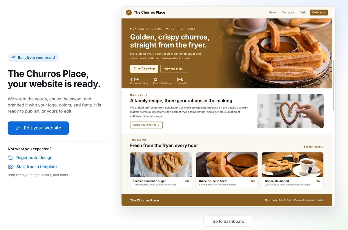
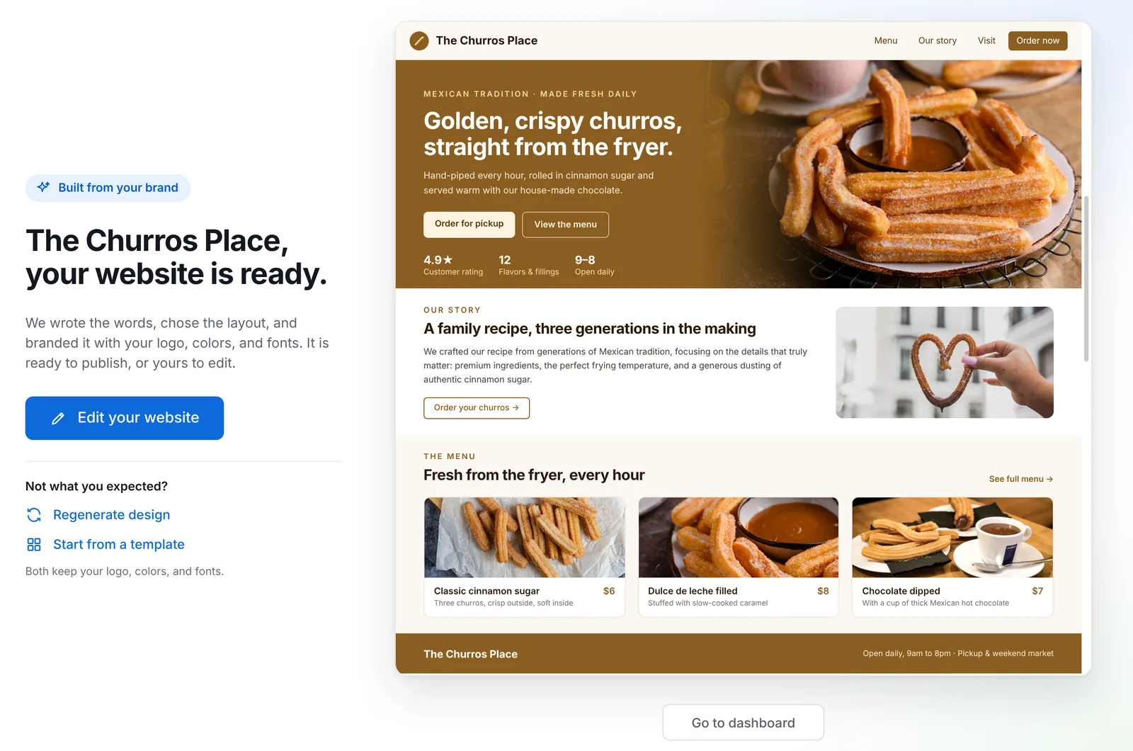
Onboarding reveal: The Churros Place website, built from the brand and ready to publish

At a glance

Sole PM, LOGO.com (1M+ monthly visitors)
Funnelpost-signup onboarding
North Starupgrade conversion to Brand Plan
Guardrailstime-to-value, onboarding completion, refund / early churn rate

Problem

Most users arrive for a free logo (more than 98% start there), but the business depends on what comes next: website, domain, business email and brand assets in a membership. After signup, users landed on a dashboard and had to find and set up each product on their own.

  • Users got their logo and left. Known mainly as a logo editor, they didn't know what else we offered or why they needed it.
  • Too much friction: getting any other product took several clicks, and the burden of finding the right solution was on the user.
  • We lost more than 40% of users before they engaged with any of the products that drive revenue.

The insight: we were asking users to imagine the value of a membership. Users don't buy imagined value, especially non-technical founders who came for one free thing.

Hypothesis

If, instead of a dashboard, we show each user their own brand already built (their website, their domain, their brand kit, with their logo and colors), conversion will rise because the decision changes from "should I pay for tools?" to "do I want to keep what I already see?"

Solution: the reveal, not the tour

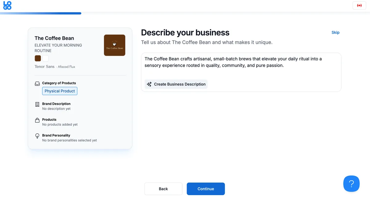
  1. A few questions about the business: what they sell, who they are, vision, brand tone. This is also the input our AI builder needs, so the questions are not a form: they are the first step of the product working.
  2. A website ready to publish, built by our AI website builder from their brand. Regenerate, edit, or publish in one click.
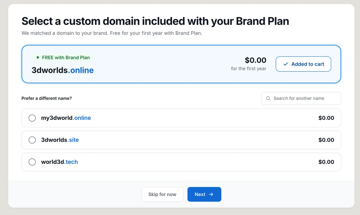
  3. A domain already matched, ready to claim and connect in one click, removing the classic website+domain setup friction.
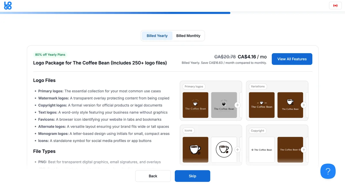
  4. Brand Kit: every logo version and file, and what each is for.
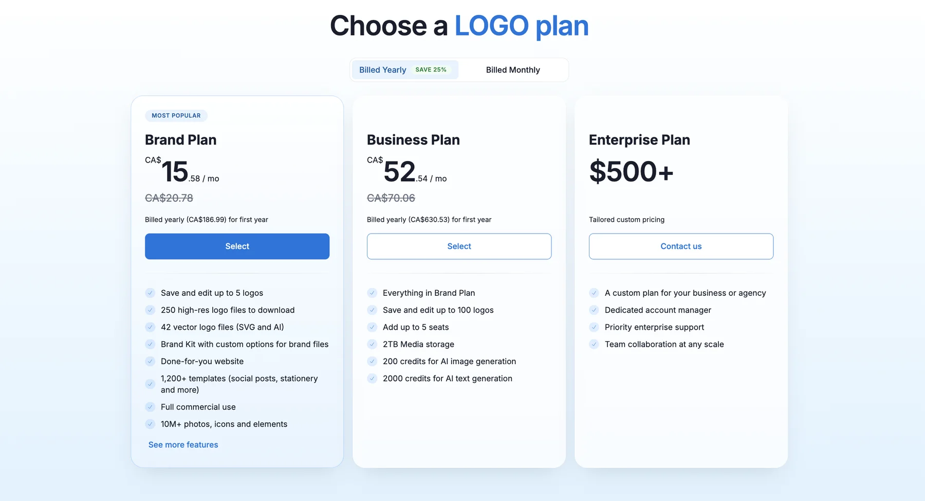
  5. The Brand Plan, presented last: the plan that includes all of it, shown only after the user has seen its value in their own brand.

Order is the strategy: value first, price last. A plan page before the reveal is a sales pitch; after the reveal, it is a receipt.

1

Tell us about your business

Describe your business step, with an AI-written description
2

Your website, ready to publish

Your website is ready: a complete site built from the brand
3

Your domain, ready to connect in a click

A custom domain matched to the brand and added to the cart
4

All the logo versions included in your brand kit

Logo package with primary logos, variations, icons and more
5

Finally, the plan that includes it all

Plan options, with the Brand Plan marked as most popular

Key decisions and trade-offs

1. Questions upfront vs. straight to dashboard. Asking questions right after signup adds friction at the moment of highest drop-off risk. We accepted it because each answer visibly improved what the user saw minutes later; a question that produces a visible result does not feel like friction, it feels like progress.

2. Generate real assets for free users vs. cheap previews. Generating a real website/domain match for users who may never pay has a real AI cost. We accepted that cost at the top of the funnel because a real, personal asset converts and a generic mockup doesn't, and we managed it with the same cost discipline from the AI Website Builder work, where rebuilding the pipeline cut cost per generated site by 80%. DFY is the monetization surface, the AI Builder is the engine, and its unit economics are what made DFY viable.

3. Bundle vs. à la carte. Instead of selling website, domain and email separately in the flow, the reveal presents them as one Brand Plan. Presenting the products as a bundle lifted yearly plan purchases by 68% and domain attachment 5x compared with selling them separately, because the domain stopped being an extra decision and became part of "my site is ready."

Experimentation

We did not ship this to everyone at once. The flow was tested against the dashboard-first experience, watching upgrade conversion as the primary metric and onboarding completion + time-to-first-publish as guardrails. A related monetization experiment, localized market pricing tests for India, the Philippines and Indonesia, lifted monthly purchases ~6x.

Impact

Onboarding became the main conversion point of the platform.

60%Of users upgrade through the onboarding flow
+50%Purchases through the onboarding flow
~6xMonthly purchases from localized market pricing tests (India, Philippines, Indonesia)
+68%Yearly plan purchases from bundling
5xDomain attachment from bundling

Failure modes we designed for

  • Generated site the user dislikes → regenerate / edit / publish anyway, never a dead end.
  • Domain suggestion that feels irrelevant breaks the magic instantly → show the matched domain as a recommendation with alternatives one click away, never as a forced cart item.
  • The reveal takes too long → the journey is staged step by step so value appears progressively; the user is never staring at a loading screen waiting for "magic."

What I learned / would do differently

Activation is not teaching users where things are. It is making the value undeniable before asking for money. I would instrument the reveal step-by-step from day one. In the first version, we knew the flow converted better before we knew which step of the reveal did the heavy lifting, and that delayed the bundling and pricing iterations that produced the biggest lifts.

Making our logos truly unique by integrating AI-generated icons.

We transformed our powerful logo editor so every user gets unique AI-generated icons, created just for their brand.

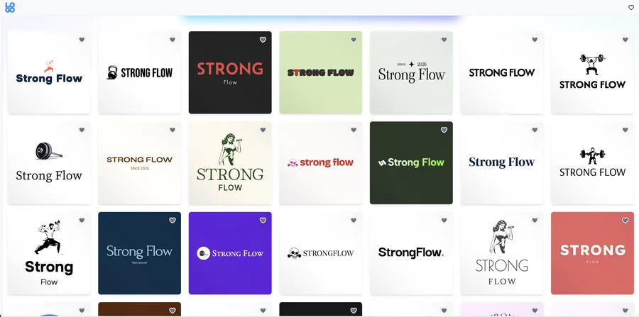
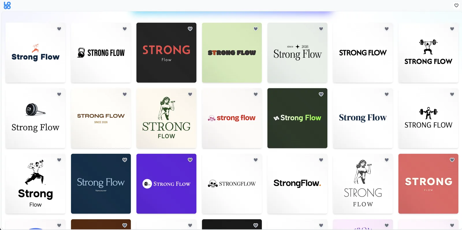
Logo ideas page for Strong Flow: every logo idea with a unique AI-generated icon

At a glance

Sole PM, LOGO.com
Surfacelogo editor (where 98%+ of users start)
North Starsignup completion / logo completion
Guardrailscost per usable icon, generation latency in the editor, icon rejection/regeneration rate

Problem

Our editor was powerful and templates were designer-made, but every icon came from the Noun Project stock library, so anyone could use the same icon. Users felt their logos were generic and didn't feel connected to the graphic we suggested.

At the same time, ChatGPT and Gemini can generate a "logo" in seconds. But off-the-shelf AI wasn't the answer: image models make pictures. A logo icon has to be:

  • Simple, and recognizable at any size
  • A clean vector, not a detailed, gradient-filled image
  • On-template, fitting the type and layout around it

And it has to stay professional and fully editable, which raw AI output is not. It tends to be busy, saturated, and far from basic design standards.

The question: how do we give every user an original icon made for their brand, while keeping the logo professional and fully editable?

Solution: our own pipeline, not a model API pasted in

Generation + vectorization. Fast, low-cost image models generate each icon, and our proprietary system turns it into a clean SVG: removes the background, merges similar colors, keeps shapes flat and solid, so the icon can be edited like any other element in the editor.

Styles made for logos. We defined 10 icon styles, from ink and brush to technical and full color, and tuned each one with our designers to look right inside our templates. A style is a constraint system: it tells the model what "a logo icon" means before it generates anything.

A system around it. We updated the editor, the templates and the logo ideas page so AI icons show up everywhere. We kept Noun Project stock search too, because stock still has value as coverage and fallback.

Two entry points:

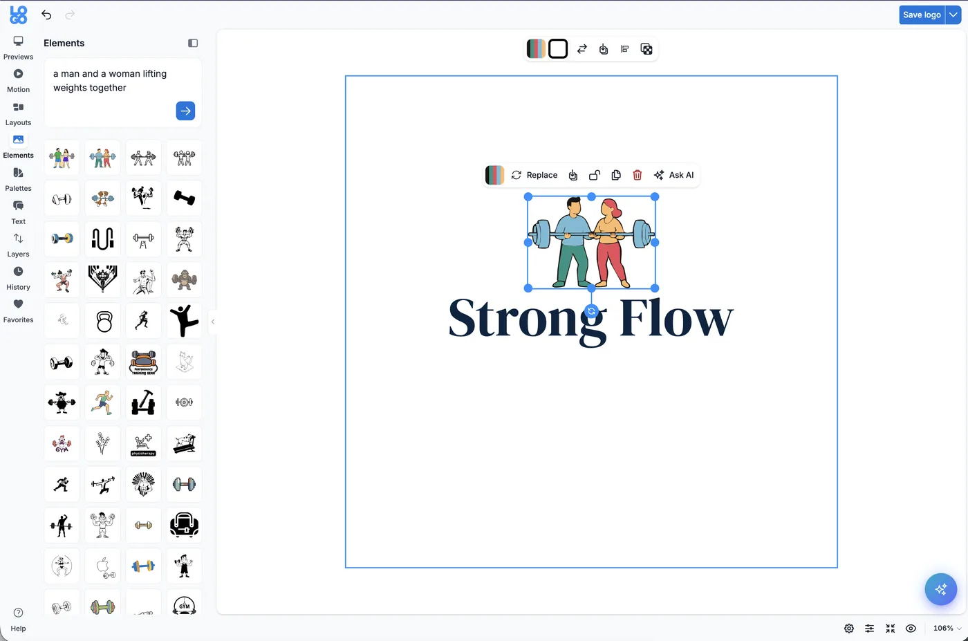
  • Create your own: anywhere in the editor, describe the icon you want; the pipeline generates a set made for that request, in your brand colors, ready to edit.
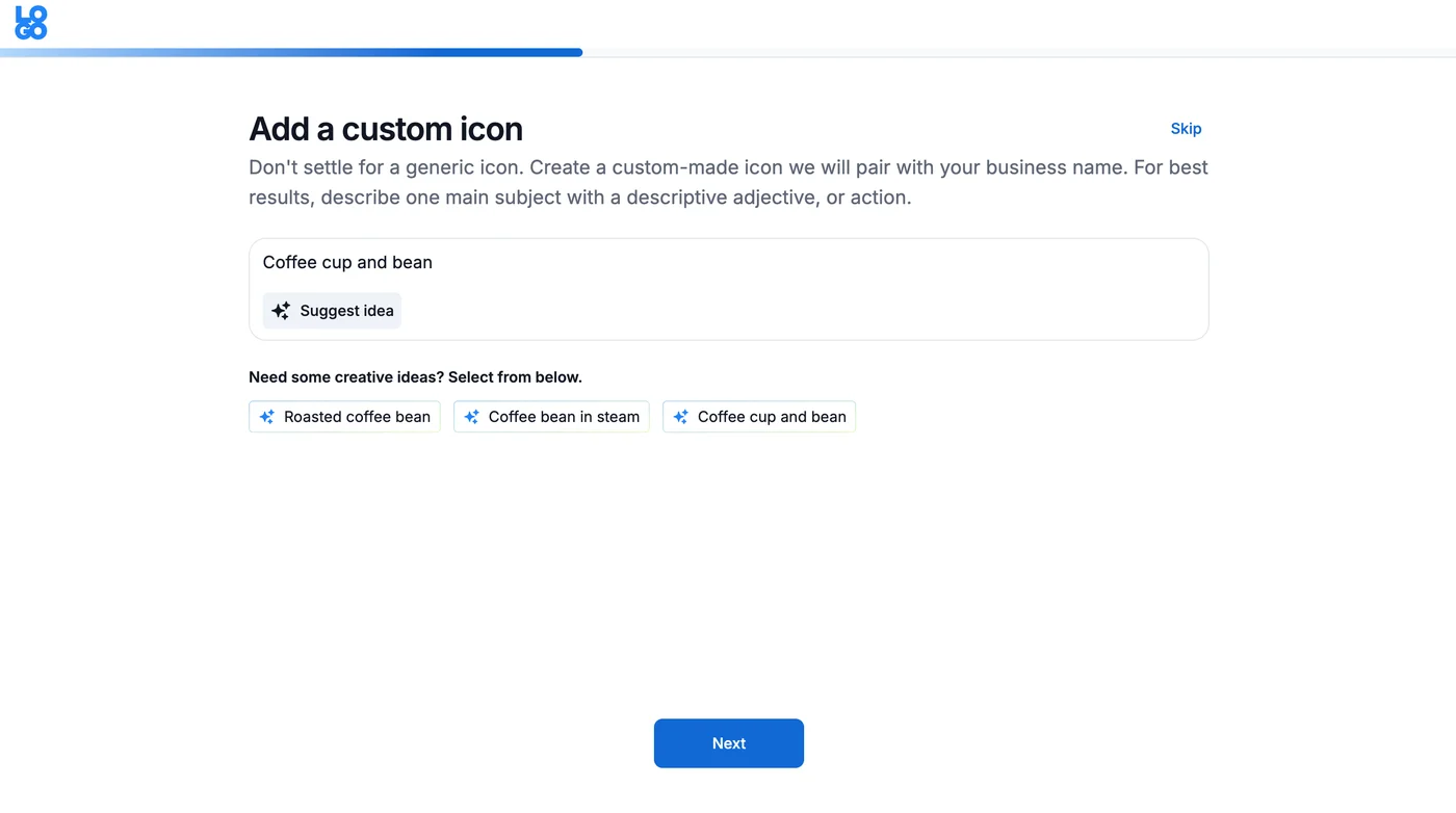
  • Made for you: we refine the brand description users give us earlier in the flow, so the logo ideas page already shows logos with icons made for them.
Logo editor: a prompt generates AI icons that fit the Strong Flow logo template

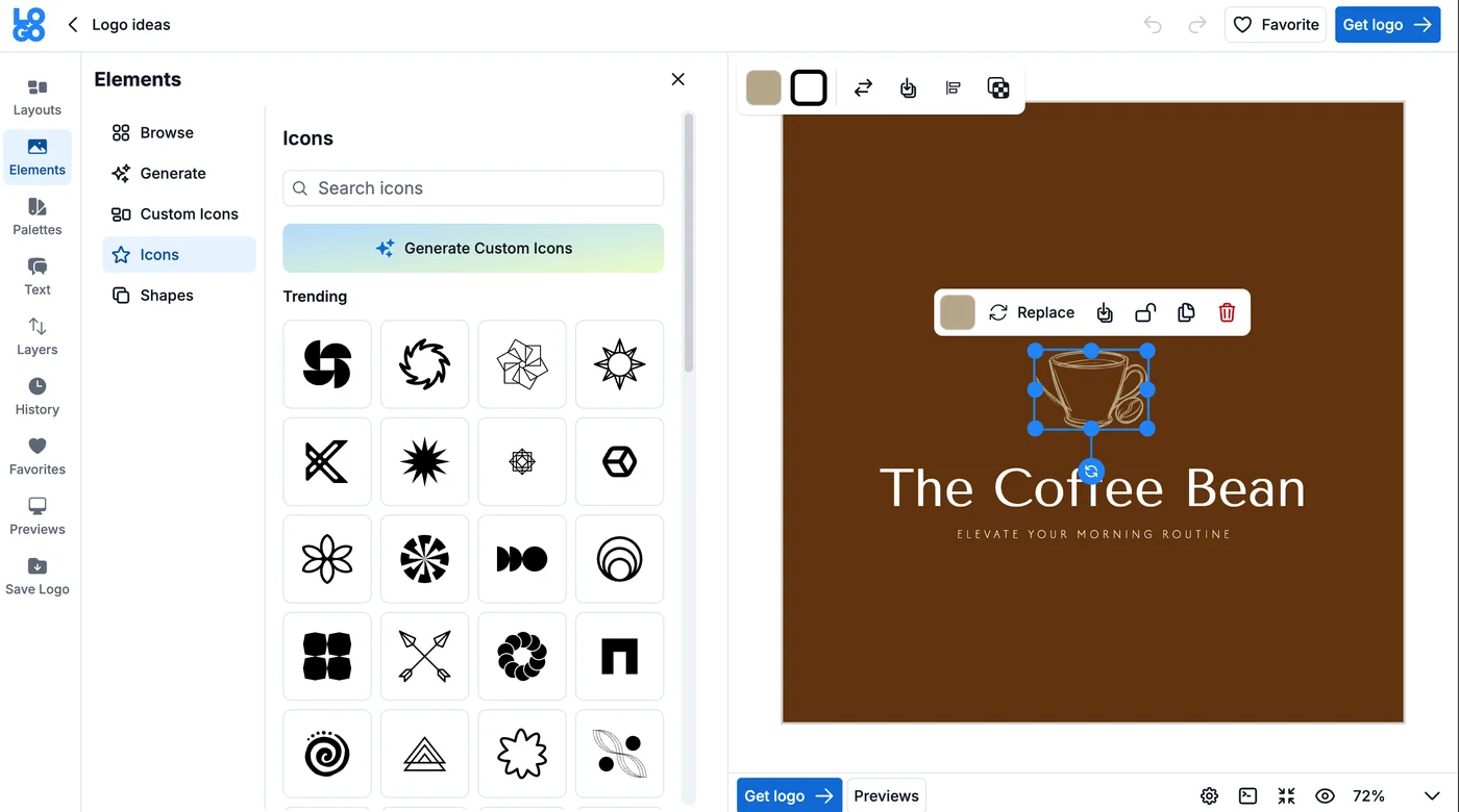
Create your own, anywhere in the editor

Logo editor with a Generate Custom Icons button next to the icon library

Made for you, during the logo flow

Logo flow step asking users to describe a custom icon, with AI-suggested ideas

How we evaluated quality: the icon eval

An icon is the hardest AI output to judge: it has almost no room to hide. Our evaluation combined formal testing (we compared image models and ran multiple formal image tests with a vector-comparison tool) with criteria only a designer can set:

  • Recognizable at small sizes: if it doesn't read at favicon size, it isn't a logo icon, however pretty it looks large.
  • Simplicity: flat shapes, limited colors, no detail that disappears or turns to noise when reduced.
  • Vector cleanliness: after conversion, the SVG had to stay editable, with clean paths, merged colors and no raster residue.
  • Template fit: the icon had to work with the typography and layout of the template, not just look good alone.
  • Brand relevance: generated for this business and this description, not a generic category symbol.

The metric that actually governed model and prompt decisions was not cost per generation, it was cost per usable icon: a cheap model whose icons designers/users rejected is the most expensive model you can ship. That is the same cost-quality loop as the Website Builder, applied per asset.

The loop

Generate in a defined style → vectorize to clean SVG → check against the style and template constraints → if it fails (too complex, off-style, unrecognizable small), adjust and regenerate rather than showing the user a bad set. The user sees a curated set of options, never the raw output stream. In a logo editor, showing every generation teaches users the technology is unreliable; showing a good set teaches them it is magic.

Key decisions and trade-offs

1. Build a pipeline vs. use a frontier image model directly. A bigger model gives richer images, and richer is exactly what a logo icon must not be. We chose fast, low-cost models + our own vectorization and style system over raw output quality.

2. Keep stock icons. Replacing the library entirely would have been a cleaner story and a worse product: AI generation can fail or miss a niche concept, and a trusted fallback keeps the editor reliable. AI became the default for originality, stock stayed for coverage.

3. Full color came later, deliberately. We launched with simpler styles first and added full-color icons as a later release, and that release alone lifted signups 7.9%, which told us users weren't just accepting AI icons, they were choosing the product because of them.

Rollout and experimentation

Every generation has a cost, so we reviewed price, quality and impact at every step. We first released AI icons to 10% of Tier 1 users and ran A/B tests against regular icons before rolling out more widely.

Impact

84%Of US users chose a custom icon
+10%Signup completion when users engaged with icons
+7.9%Signups after launching full-color AI icons

Commercially: AI features turned the free editor into a paid upgrade: commercial use of the logo and its custom icon became a second key conversion point for the platform.

Failure modes and risk

  • Too complex / busy generations → style constraints + vector simplification, not a better prompt alone.
  • Near-duplicate icons for similar businesses would destroy the "unique" promise → the generation is conditioned on the user's specific brand description and colors, so the same prompt in a different brand context produces a different asset.
  • Similarity / IP risk: an AI icon must not land too close to an existing famous mark; keeping a human-designer-defined style system and template frame around generation was part of keeping output in original, generic-symbol territory rather than imitating specific logos.

What I learned / would do differently

In AI products, constraints are the product. The model was the commodity; our value was the 10 styles, the vectorization, the template fit and the evaluation of what counts as a logo. I would build the small-size recognizability test into the automated pipeline from the start. In the early rounds, that judgment still depended too much on a person looking at the output, which doesn't scale with generation volume.

AI made me a more efficient PM. Here's how I used it every day.

The automations and workflows that turned recurring PM work into systems the whole team could use.

Less time searching and documenting. More time deciding and advocating for the users.

SlackNotionLinearMixpanelHelpScoutStatus updateHealth reportPRD readySprint demo

At a glance

Sole PM, LOGO.com
Usersthe whole product/engineering/support team
Thesisrecurring PM work is a product problem: define what to evaluate, how to evaluate it, connect it to the tools the team already uses, and communicate results where the team already is.

Problem

As the only PM, I was the team's memory. I built the reports, reviewed analytics, surfaced red flags, shared KPIs, organized sprints. Every question about processes, decisions or data went through me. A big part of my time didn't go to judgment, decisions or research. It went to gathering information and documenting: recurring work that made me the bottleneck and kept the team's knowledge in one person's head.

Principle

I treated each automation like a small AI product, not a shortcut: a defined user, a defined input, an evaluation criteria I set, and a human (usually me) still accountable for the decision. The AI gathers, drafts and flags. People decide. Automations that blurred that line were the ones I didn't ship.

The systems

Mixpanel health report: a daily analytics agent

I connected Claude to my Mixpanel KPI boards and gave it every factor it had to consider, so it wouldn't just read numbers but analyze what changed and how our releases affected them. Every morning it produces a report with a traffic light per main KPI, colored by criteria I defined. When a KPI is red (a sharp drop in signups, for example), it investigates, proposes a theory of what failed, and suggests next steps. If an overnight release broke something, we had a diagnosis in the first hour of the day.

The PM work here is the eval design, not the connection: defining what "red" means per KPI (threshold, comparison window, seasonality/release context) so the agent flags real anomalies instead of noise. A health agent that cries wolf loses the team in a week; the criteria, and tuning them when a flag was wrong, were the product. Every report links its evidence, because a theory without a source is just a hallucination with confidence.

AI PRDs: turning tribal knowledge into a system

Over the years we simplified our PRD structure many times around what the team actually needed. I turned that structure into a system with Claude: anyone (support, marketing, or me) can describe a customer request, problem or idea, answer a few follow-up questions, and get a complete PRD: user stories, acceptance criteria, edge cases, ready for developers and for our AI dev bot.

The follow-up questions are the product design: a PRD system that accepts a one-line idea and returns a confident document teaches the team to skip thinking. The intake forces the requester to answer the questions a PM would ask (who is this for, what happens today, how will we know it worked), so the output is a PRD, not a formatted guess.

Sprint demos + status updates: loops on a cadence

  • Every two weeks, an automation with Claude and Linear builds the sprint demo doc: every feature launched, with its impact researched in Mixpanel based on the events defined in its PRD. Ready for devs to present at sprint end.
  • An automation reviews Slack, Notion and Linear and posts a daily/weekly digest to Slack at the start of the day: what happened, what's next, red flags. The whole team starts with the same information.

Cadence is a design decision: health daily (problems compound), status daily/weekly (alignment decays fast), demos bi-weekly (tied to the sprint). Matching the loop's frequency to the cost of being late is what keeps automations useful instead of noisy.

HelpScout → product request

When our support lead flagged a conversation in HelpScout, it automatically became a PRD ready to review, closing the loop between what users tell support and what product builds, without a manual hand-off in between.

Deep-dive research on demand

Before any project, a ready-made process produced a competitor deep dive: best practices summary and links to review. It was a fast starting point that reminded us not to reinvent the wheel.

Figma ↔ Claude ↔ PRD

We created a design system document Claude used from the start, connected Claude to our Figma design system and back to Linear. From an idea, one command created the full PRD with the design attached. From a PRD, Claude produced a reviewable design; once approved, it went right back into the PRD.

Failure modes and trust

  • Wrong KPI theory → the report presents a theory and next steps, never an automatic action; I reviewed red flags before the team acted.
  • Alert fatigue → traffic-light criteria tuned over time; a report that flags everything flags nothing.
  • Over-trust in generated PRDs → PRDs arrive as drafts ready to review, with a human owner, not as approved specs.

Impact

Recurring work that used to take hours now runs on its own, and the team can find answers without waiting for me. Everyone had the same level of information, we stayed aligned, and my time moved to what matters most: talking to users, making decisions and shipping.

What I learned

AI didn't make me a faster PM. It removed me as the bottleneck for information, which is a different thing: the team's knowledge stopped living in one person's head and started living in systems anyone could use. That is also what I now look for in any AI product: not "does the model work?", but "whose bottleneck does this remove, and who is still accountable when it's wrong?"